
When Apple unveiled the iPhone 17 Pro, much of the attention turned to the product’s design and hardware innovations: the elongated plateau camera, the refined titanium body, and the increasingly minimal industrial form. Yet for typographers and designers, the most striking shift was not physical but visual. It was the new typographic voice: a bold, extended wordmark spelling “PRO” that departs radically from Apple’s established typographic canon.
In this moment, Apple appears to have abandoned the quiet precision of its long-standing typographic identity in favour of something unapologetically muscular. This single typographic decision marks one of the most intriguing evolutions in Apple’s visual language in recent years.
A Break from the Tradition of Restraint
Apple’s typographic tradition has been one of restraint and clarity. From the days of Garamond in early marketing materials to the era of Myriad, and then to the bespoke San Francisco family, Apple’s typography has consistently sought harmony between elegance, legibility, and neutrality. The visual character of Apple has always been one of quiet confidence, never shouting for attention but inviting contemplation.
The San Francisco family, introduced in 2015 and now a cornerstone of Apple’s UI and branding systems, was designed in-house to optimise legibility across screens of varying sizes. Its humanist geometry and calibrated optical sizes have become synonymous with Apple’s visual voice. It represents the rationality and grace that underpins the company’s design philosophy.
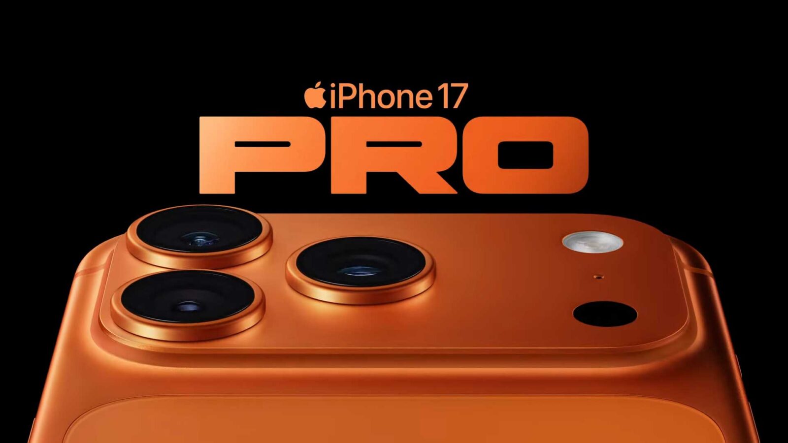
The iPhone 17 Pro’s “PRO” wordmark, however, disrupts this lineage. It is a visual statement that feels deliberately assertive, almost theatrical in comparison. Set in a bold, extended grotesque sans serif, the typography stretches across the page with the confidence of a modernist poster. This is not the San Francisco we know.
Form Echoing Material
The most revealing clue to this typographic decision lies in the physical form of the device itself. The iPhone 17 Pro introduces what Apple calls the “plateau” camera module, a sculptural, horizontal form that spans the rear of the device. In the “PRO” lettering, one can see a clear dialogue between type and object. The extended width of the letters mirrors the proportion of the plateau, while the circular form of the “O” visually echoes the camera lens.
This is a sophisticated typographic gesture: the type reflects the product’s architecture. It is a principle of form echoing content rarely used by Apple, a company known for abstraction rather than literalism. In this instance, the brand’s typography does not merely accompany the product; it interprets it. The wordmark becomes a typographic abstraction of the hardware itself, transforming the “PRO” into a semiotic reflection of the phone’s body.
This level of typographic integration signals a philosophical shift. It acknowledges that the boundaries between digital and physical design have dissolved. The typography becomes a mirror of industrial design, binding material form and visual communication into a single design language.
Why Apple Chose Boldness Now
Why would Apple, a company so committed to restraint, choose such a typographically bold and extended form? Several factors converge here, aesthetic, strategic, and cultural.
Firstly, this typographic change marks a differentiation strategy. The “Pro” line has long been Apple’s flagship, but typographically, it has never truly looked distinct. By adopting an extended, high-impact form, Apple creates a visual language that immediately separates the Pro models from the rest. The typographic voice now speaks in the tone of authority, precision, and strength.
Secondly, there is an element of brand rejuvenation. As product design stabilises into a recognisable archetype, Apple must innovate within the realm of perception. Typography becomes the new surface of design evolution. A bolder typeface reintroduces novelty, asserting that the Pro identity is dynamic and evolving.
Thirdly, this shift aligns with a broader cultural trend in typography: the resurgence of extended grotesques and compressed sans serifs in technology branding. These typefaces evoke the language of industrial design, recalling the aesthetics of 1970s modernist posters, space exploration, and machine typography. By evoking that lineage, Apple subtly positions the iPhone 17 Pro as both futuristic and timeless, a tool that belongs to the era of human invention, not merely to consumer technology.
Typography as Industrial Language
From a typographic standpoint, the extended bold sans serif used in the iPhone 17 Pro is not merely a stylistic flourish. It performs a linguistic function. Width and weight in typography communicate physicality. An extended form suggests expansion, while a bold weight suggests solidity. Together they produce a typographic experience that feels architectural rather than decorative.
The “PRO” lettering reads like a piece of precision-engineered metal — it has mass, proportion, and resistance. The counters are tight, the apertures compact, and the letterspacing taut. The letters behave like components rather than strokes. This gives the typography a mechanical presence that parallels the materials of the device: titanium, glass, and ceramic.
For the typographer, this is a fascinating interplay between materiality and form. The typographic surface becomes a continuation of the product’s tactility. It extends the physical identity of the iPhone into the realm of perception. This is typography behaving as industrial design.
The Awful Side of the Boldness
However, not all typographic masters would approve. To many trained eyes, Apple’s new typographic direction feels visually heavy-handed. It abandons the subtlety, proportion, and typographic grace that once defined the company’s visual culture.
The extended “PRO” wordmark, while conceptually aligned with the device’s design, visually collapses under its own weight. It trades nuance for spectacle. The horizontal expansion of the letters disrupts balance, producing awkward spacing and optical distortions that undermine typographic elegance. Where Apple once whispered with precision, it now shouts with excess.
The result is what one might call the tyranny of thickness: letterforms so inflated with weight and width that they lose their internal rhythm. The relationship between counters and strokes becomes tense, and the eye tires quickly. Instead of leading the gaze through clarity, the typography demands attention by force.
This is precisely the kind of aesthetic that early modern typographers of the 1940s warned against. Designers such as Jan Tschichold, Beatrice Warde, and Herbert Spencer cautioned that the purpose of typography is not to perform, but to serve. Tschichold argued that “perfect typography depends on perfect harmony between the text and its presentation” (Tschichold, 1947). Apple’s new visual language, though conceptually clever, breaks that harmony by prioritising form over function.
Beatrice Warde, in her famous essay The Crystal Goblet (1930, widely reprinted throughout the 1940s), described good typography as “a crystal goblet through which the wine of communication may be seen, not the vessel that distracts from it.” By that measure, Apple’s extended “PRO” wordmark becomes a gilded chalice — ornate, commanding, and self-conscious. It no longer disappears to let meaning shine through.
The wartime typographic movement of the 1940s, which emerged amid economic constraint and material scarcity, valued modesty and efficiency in form. Designers such as Herbert Bayer and Lester Beall approached typography as a social instrument, not an aesthetic indulgence. They understood restraint as moral discipline. Apple’s new typography, by contrast, feels inflated — both visually and conceptually. It reflects a culture of technological spectacle rather than typographic truth.
In essence, this new “PRO” aesthetic may symbolise the end of typographic humility in Apple’s design language. Where Tschichold sought proportion, Apple seeks projection. Where Warde valued invisibility, Apple celebrates impact. Where the early modernists built unity between type and purpose, Apple constructs a typographic performance that serves branding before readability.
It is a brilliant piece of marketing. But it is not good typography.
Breaking the Grid of Familiarity
What makes this typographic decision remarkable is how uncharacteristically un-Apple it feels. Apple’s typography has always been a paragon of order: optical balance, tight grids, and classical restraint. The “PRO” wordmark disrupts this visual grammar. It feels almost rebellious.
Yet this disruption is precisely what makes it powerful. By breaking the established rhythm of its visual language, Apple creates a moment of typographic attention. It is the typographic equivalent of silence in a piece of music, a deliberate pause that heightens the listener’s awareness. The contrast between the serene typographic consistency of Apple’s overall identity and the abrupt boldness of the Pro wordmark creates a visual accent that commands the eye.
Typography here becomes not just a functional carrier of language, but an expression of emotion and hierarchy.
Towards a Typographic Future
Apple’s typographic experimentation with the iPhone 17 Pro opens a new chapter in the company’s design evolution. It hints at a future where typography and form are inseparable, where letters become design objects that participate in the storytelling of technology.
This bold typographic departure should not be read as a rejection of Apple’s established typographic discipline, but rather as its expansion. The San Francisco family will continue to define the user interface, but the branding layer — especially at the product level — may now embrace greater expressive freedom.
If this direction continues, we may see typography play an increasingly active role in Apple’s design narrative: not simply as a means of reading, but as a way of seeing. The typographic voice of Apple may finally begin to speak with accents, rhythms, and tonalities that reflect the diverse emotional register of its products.
In the iPhone 17 Pro, Apple has chosen to speak not softly, but with strength. It has allowed typography to become architecture. Yet as the typographic masters of the 1940s would remind us, strength without clarity is vanity. And when typography forgets its humility, it risks becoming sculpture, beautiful, but mute.
References
Apple. “Apple Unveils iPhone 17 Pro and iPhone 17 Pro Max.” Apple Newsroom, September 2025. https://www.apple.com/newsroom/2025/09/apple-unveils-iphone-17-pro-and-iphone-17-pro-max/.
Creative Bloq. “Hardly Anybody Spotted This Clever iPhone 17 Pro Typography Easter Egg.” Creative Bloq, September 2025. https://www.creativebloq.com/design/fonts-typography/hardly-anybody-spotted-this-clever-iphone-17-pro-typography-easter-egg.
Tschichold, Jan. Asymmetric Typography. London: Faber and Faber, 1947.
Warde, Beatrice. The Crystal Goblet: Sixteen Essays on Typography. London: Sylvan Press, 1948.
Wikipedia. “San Francisco (sans-serif typeface).” Wikipedia: The Free Encyclopedia, last modified 2024. https://en.wikipedia.org/wiki/San_Francisco_(sans-serif_typeface).
Wikipedia. “Myriad (typeface).” Wikipedia: The Free Encyclopedia, last modified 2023. https://en.wikipedia.org/wiki/Myriad_(typeface).
💛 Love what we do at The New Art School & Design Education Talks podcast? Help keep design education alive!
✨ Join our mailing list: https://sendfox.com/thenewartschool
Explore more: https://linktr.ee/thenewartschool | @newartschool| https://newartschool.education/ | https://heretakis.medium.com/ | https://odysee.com/@thenewartschool:c
